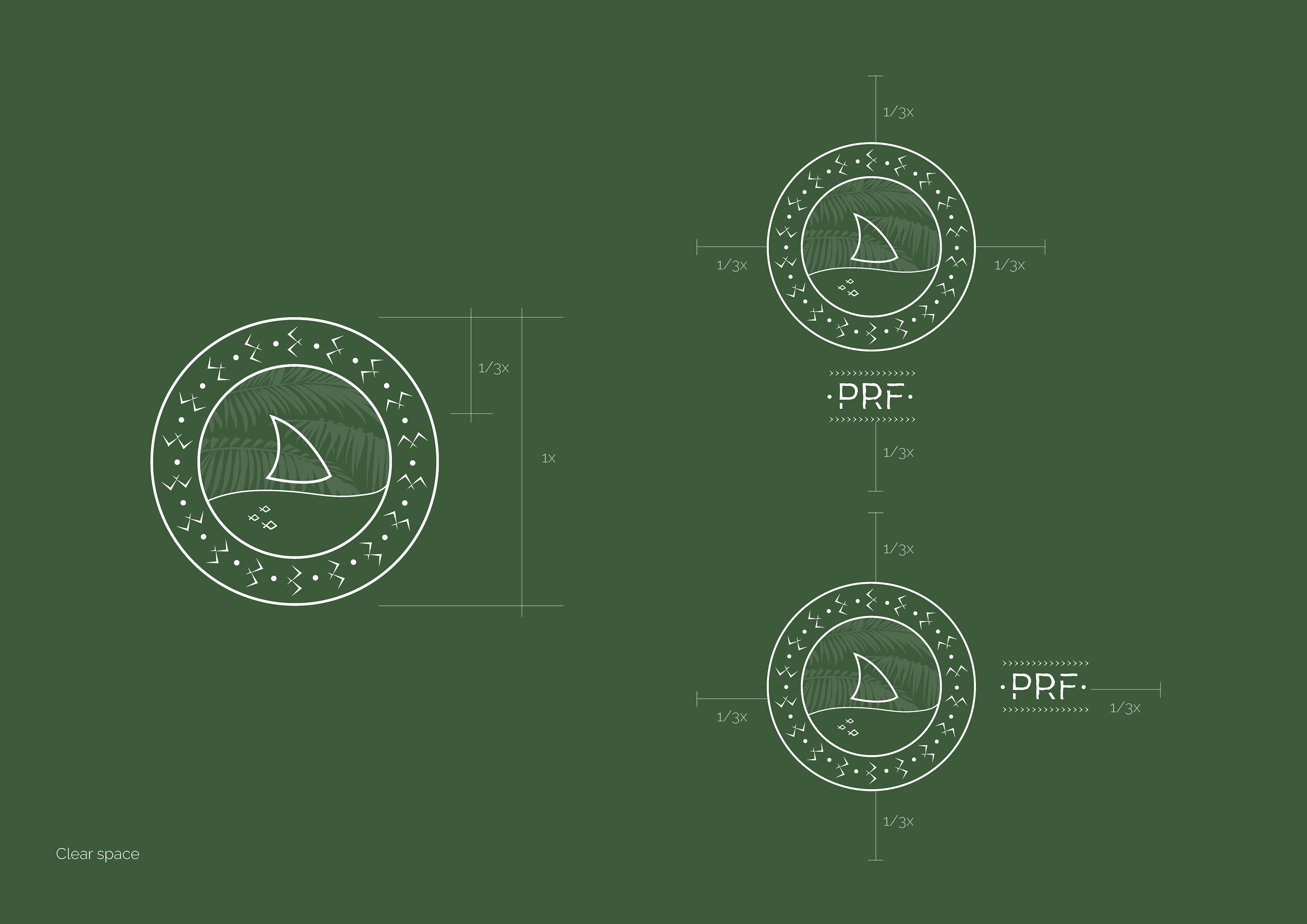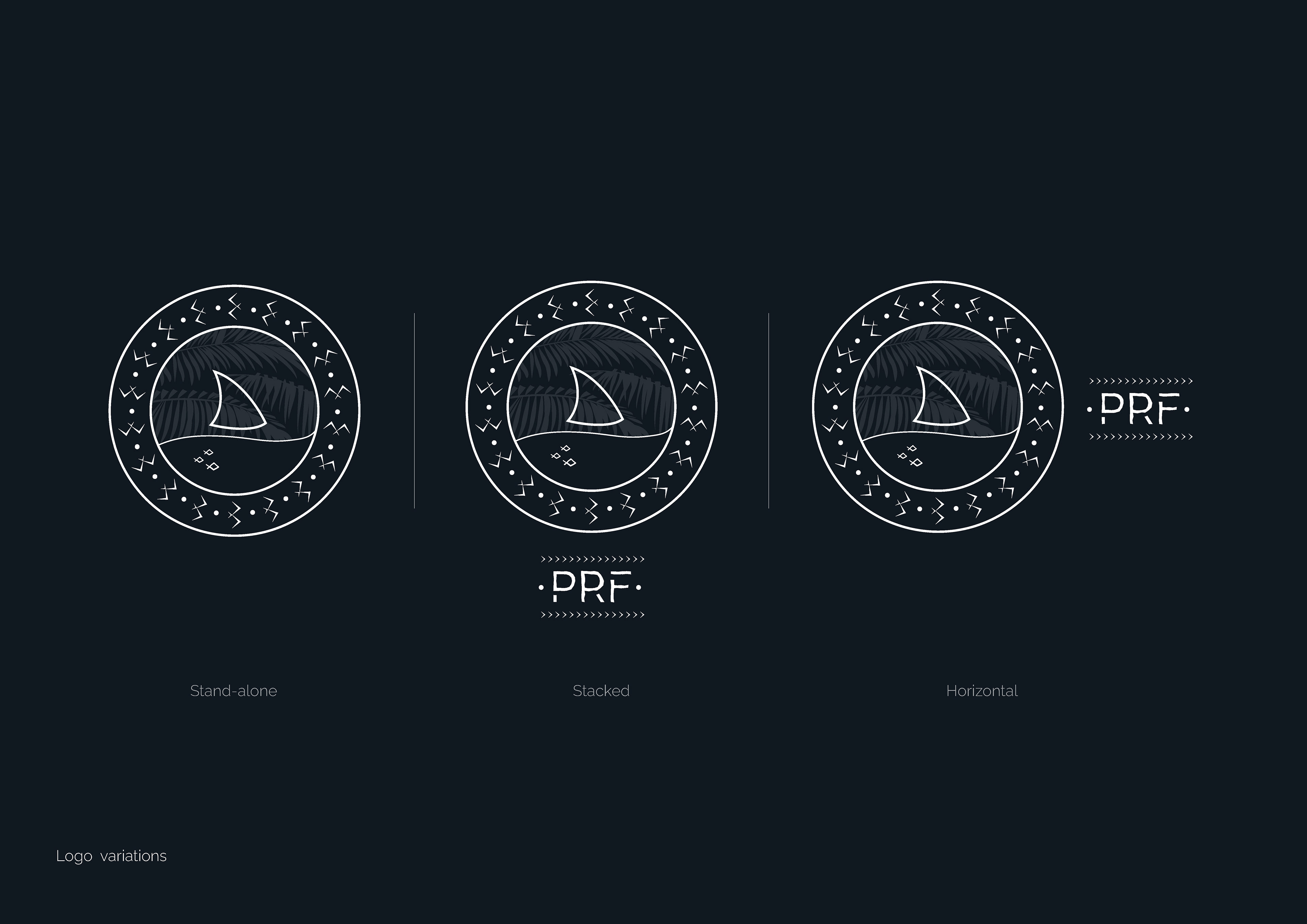
The following was my submitted concept for the Pacific Resilience Facility's new brand identity. While the submission was not selected, this project represents a meaningful exploration of Pacific cultural symbolism and its application to institutional identity design.
The concept was developed around a visual language drawn from the cultural and natural heritage of the Pacific. The brief called for a mark that could authentically represent the breadth of the region while communicating strength, unity, and purpose.
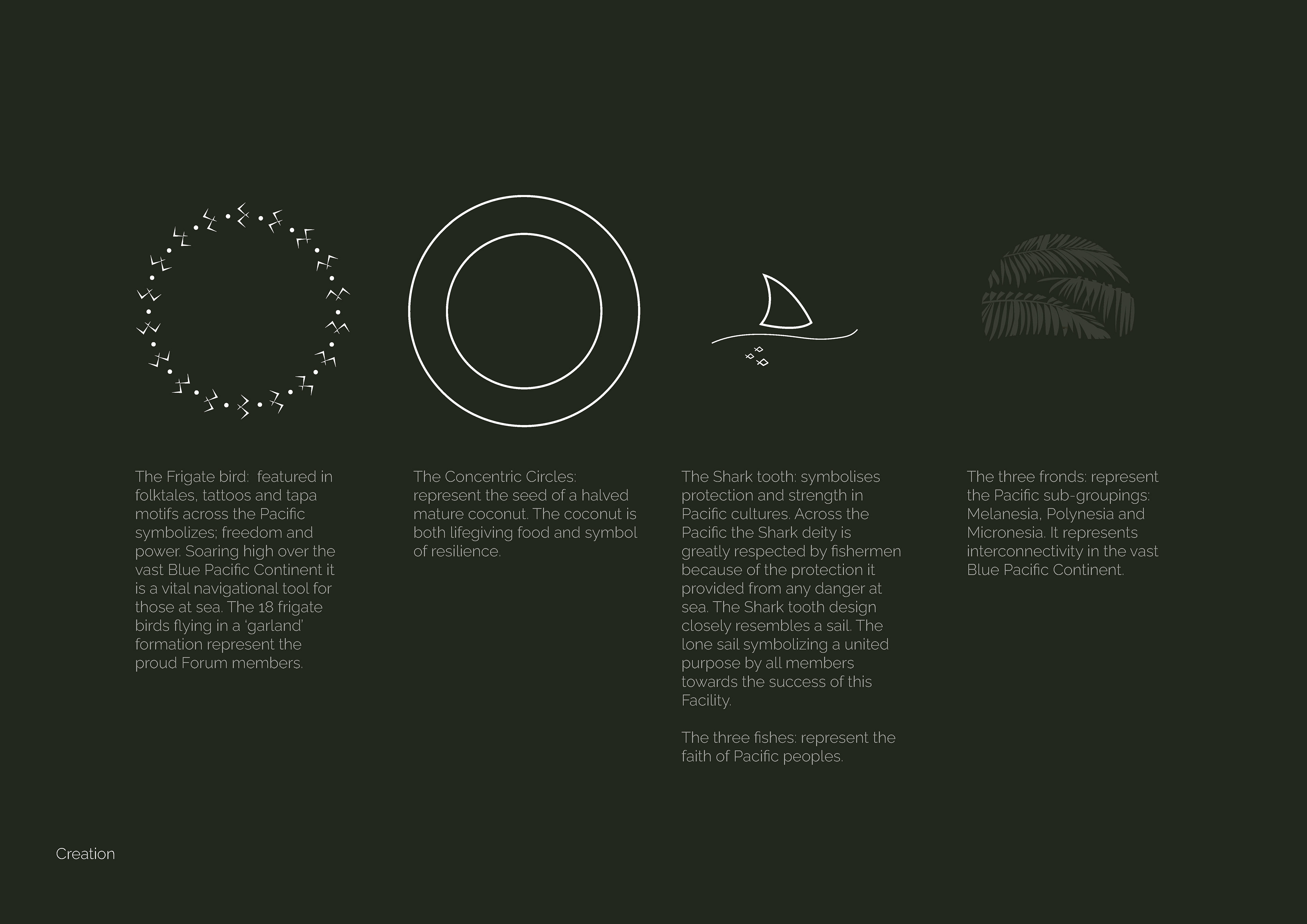
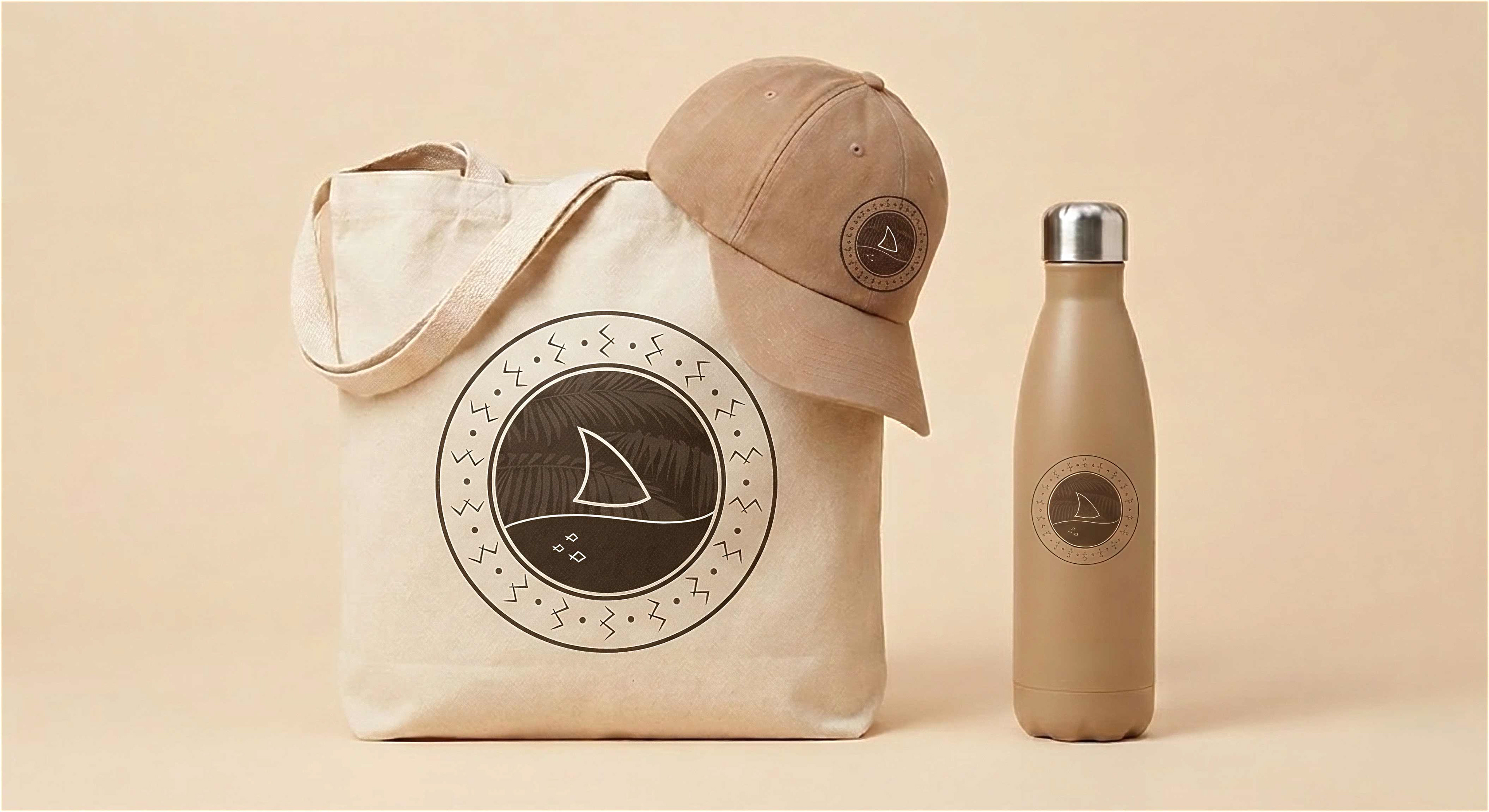
The design brings together four symbolic elements, each carrying deep cultural significance across the Blue Pacific Continent. The Frigate bird, a powerful symbol of freedom and navigation featured in folktales, tattoos, and tapa motifs, forms the outer garland with 18 birds in formation representing the proud Forum member nations. The Concentric Circles reference the seed of a halved mature coconut, a life-giving and resilient staple of Pacific life. The Shark tooth draws on its dual symbolism of protection and a lone sail, representing the united purpose of all members in supporting the Facility's mission. The three Fronds complete the mark by representing the three Pacific sub-groupings, Melanesia, Polynesia, and Micronesia, and the interconnectivity that binds them.
This submission reflects my approach to identity design rooted in cultural research, visual storytelling, and a genuine respect for the communities a brand is built to represent.